Back to work
Project 02CRM + ERP

CRM & ERP for Hospitality, Parking & Ferries

Agrupación Galicia
2024 — Present
Context

Product design for a complex CRM with ERP capabilities serving accommodation, parking and ferry operators.

The challenge

A legacy CRM/ERP managing accommodations, parking and ferry operations had grown organically without a unified design language or coherent user model. New feature requests were impossible to integrate without first fixing the underlying structure. The product needed to scale — in functionality and in team.

Approach

Working as the lead designer on a cross-functional team, I combined a systematic redesign of existing flows with the design and delivery of new features. Simultaneously managing team training and design reviews to build a shared design culture and raise the quality bar across the board.

Process
01

Audit

Mapped existing flows, identified structural inconsistencies and prioritised the highest-friction areas for immediate redesign.

02

System

Established a design system foundation to ensure new and redesigned components shared a consistent visual and interaction language.

03

Iteration

Designed and validated new features in close collaboration with engineering, always balancing user needs with technical constraints.

04

Team

Regular design reviews, training sessions and workflow planning to build team capability and maintain quality as the product grows.

Implementation cases
Autocheck-in

An arrival with no front desk, no keys and no staff involved.

From booking to access, with no involvement from the property.

We designed and implemented a self check-in flow that automates the entire arrival process in properties without a physical front desk, from the booking through to entering the apartment.

The flow connects sales and payment, guest registration, documentation and access, letting the customer complete the whole process from any device without depending on the property staff.

  1. Booking
  2. Payment
  3. Registration
  4. Check-in
  5. Access
  6. Invoice
  1. 01

    Booking and payment

    The guest books and pays online, which automatically starts the check-in process.

  2. 02

    Guest registration

    From their account area, each guest can complete their details and travel documentation on mobile, tablet or desktop, avoiding any in-person paperwork.

  3. 03

    Automatic check-in

    Once the required information is complete, the system validates the check-in and leaves the stay ready for arrival.

  4. 04

    Digital access

    When the booking date and time arrive, the guest can open the smart locks straight from their phone — no physical keys, no shared codes, no staff involved.

  5. 05

    Ongoing management

    From their account area they can review their stay details, and access and download their invoices whenever they need them.

Impact

−90%

Calls and incidents during check-in

The result was a fully digital, self-sufficient arrival flow that reduced the property’s manual work and handed control of the whole process to the customer.

The property ended up receiving up to 90% fewer calls and incidents during check-in, freeing up team time for other tasks.

More than designing a new check-in form, the challenge was connecting different moments and systems across the journey into a single coherent experience: booking → payment → registration → validation → access → invoicing.
Occupancy rack

How do you turn a chart into something that generates revenue?

Turning a hard-to-read chart into a decision-making tool.

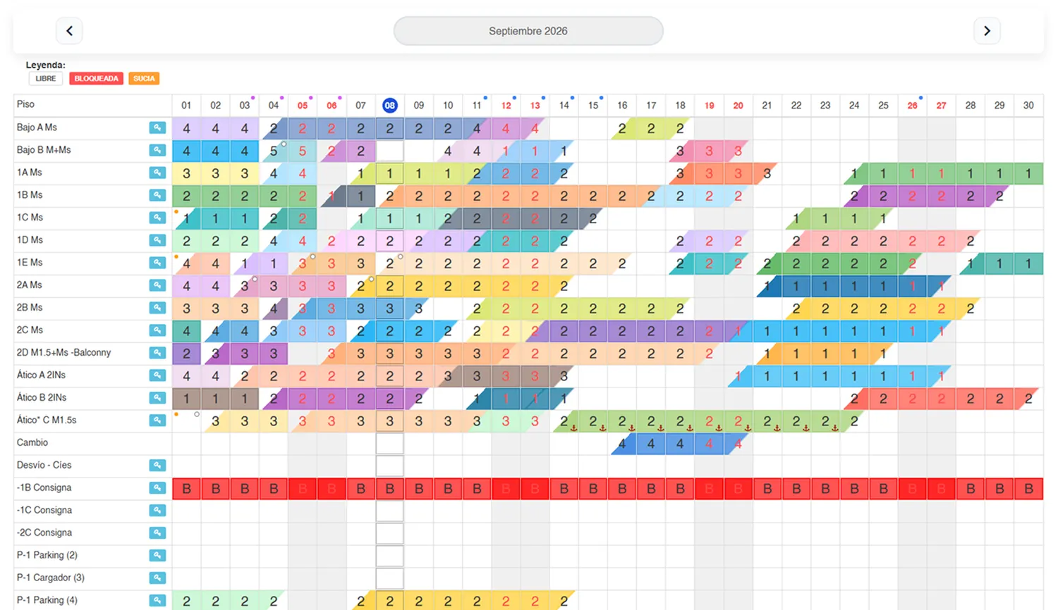
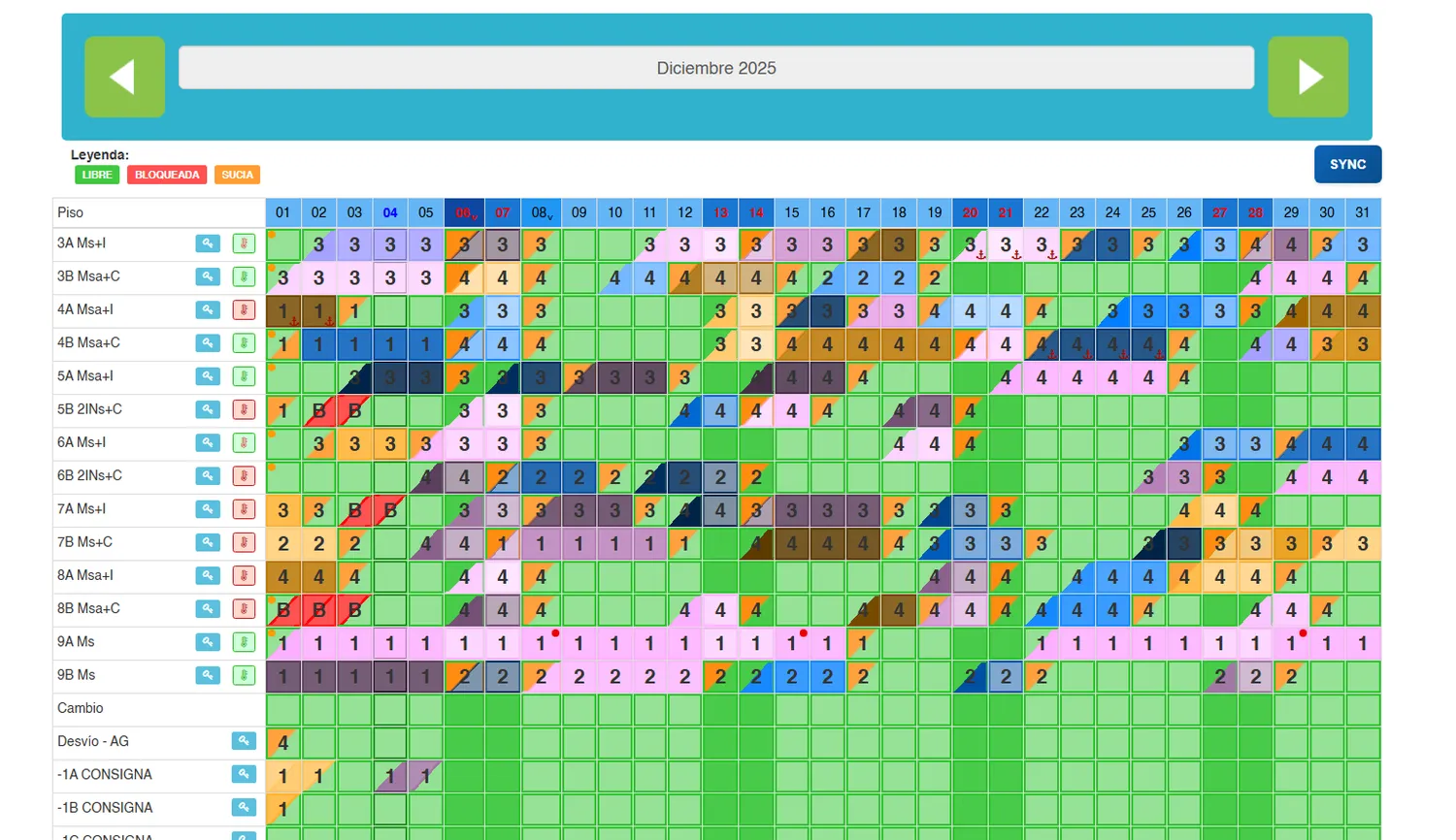
Monthly occupancy was managed through a rack view that showed the bookings, but whose information density made it hard to read availability quickly or spot opportunities to optimise.

After analysing the flow, we visually simplified the panel and improved the information hierarchy, making the distribution of bookings and the available spaces far more evident.

That made it easier for users to identify gaps, relocate bookings and optimise how reservations were distributed.

The change mattered most in high season: reading occupancy better meant taking advantage of spaces that previously could sit blocked for entire weeks, increasing the use of available inventory and, with it, the revenue generated by the property.

  1. Problem

    Occupancy was hard to interpret, and spotting opportunities took too much effort.

  2. Intervention

    Visual clean-up + better hierarchy + clearer availability and occupancy.

  3. Behaviour change

    More relocations and better use of the available gaps.

  4. Impact

    Fewer prolonged blocks and higher profitability, especially in high season.

Occupancy rack after the redesign: a light background, soft colours and a stronger typographic hierarchy, with the free gaps clearly visible.
Occupancy rack before the redesign: a very dense grid of saturated green cells where it is hard to tell which spaces are free.
BeforeAfter
Drag the divider to compare the rack before and after the redesign.

Impact

More capacity usedfewer blocked spaceshigher profitability

The redesign turned a mostly informational view into an operational tool for optimising occupancy and making business decisions.

Scope of work
Product DesignUX ResearchInformation ArchitectureUser FlowsWireframingPrototypingUI DesignUsability TestingDesign System
Outcome
  • −90%Calls and incidents during check-in
  • 100%Digital arrival, no staff involved
  • More occupancy used in high season

Ongoing project. Case study in progress.

Request full case study